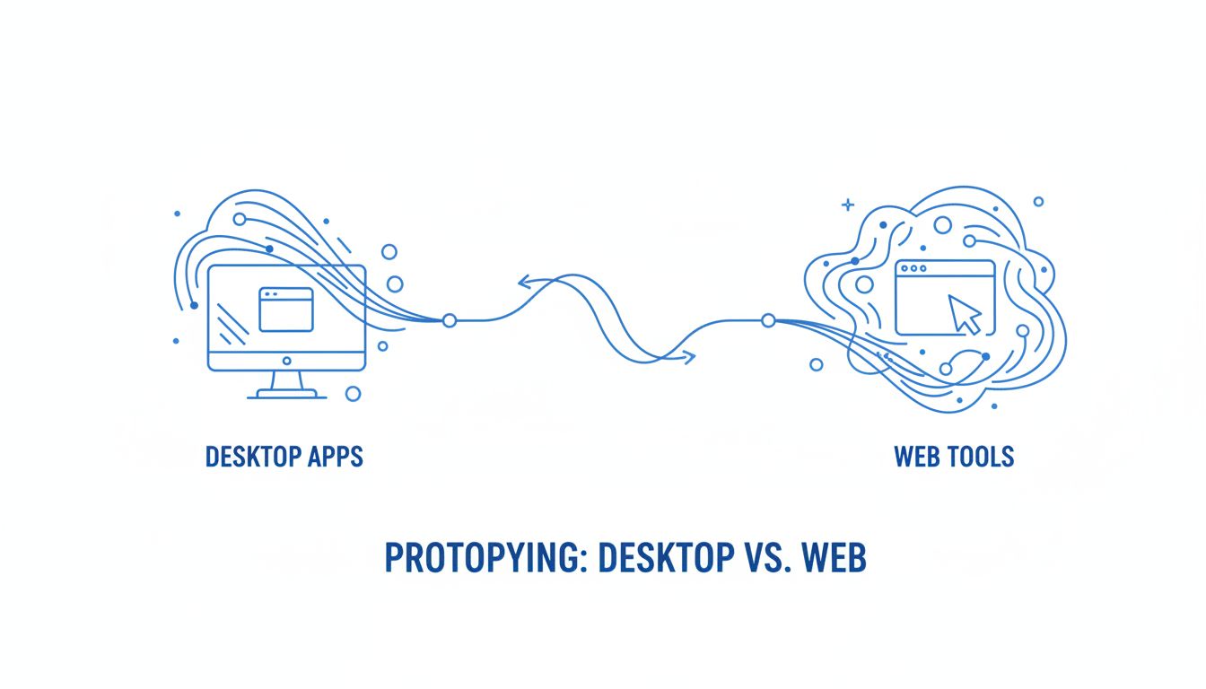
Desktop app platforms vs web tools for prototyping
You can get a long way faking a desktop app in the browser.
Until you try to test real menus, multiple windows, or offline behavior with an actual human and watch your beautiful prototype fall apart.
If you are working on serious desktop concepts, choosing to stay in web tools is already a product decision. You are deciding what you are allowed to learn. That is why it really matters whether you keep pushing in Figma, browser-based tools, or finally choose a desktop app platform over web tools for prototyping.
This is not about hating on browser tools. They are incredible for what they are. They just are not built to behave like native desktop software.
If your roadmap, your funding, or your career depends on getting a desktop experience right, you should probably stop pretending the browser is "close enough."
Let us walk through why.
Why choosing the right platform now actually matters
How early platform choices limit what you can test
Every tool quietly shapes your product decisions.
If you prototype a complex trading terminal or music production app in the browser, you will naturally design for what the browser handles well. Infinite scroll. Card layouts. Light interactions inside one main window.
You will avoid things that are painful or impossible to model. System menus. Global shortcuts. Floating tool palettes. Real file operations.
So your "MVP" gets scoped around what your prototyping stack makes easy, not around what your users actually need.
That is the trap.
Early, your goal is not to be fast at making pretty screens. Your goal is to stress test the shape of your product. Where does it break when users push it the way they push their real tools. If your platform cannot express those stresses, you get a fake sense of confidence.
Why PMs and designers feel stuck with browser-only tools
Most PMs and designers did not choose this. The stack chose them.
Your team already lives in Figma, Miro, Notion. Your devs push web builds. The org is comfortable sending a URL around.
So when you suggest a desktop app platform, you get the usual objections:
- "We do not have time to learn something new."
- "We just need to validate concepts, not build the real thing."
- "Our users can imagine the rest."
Which sounds reasonable, until you watch a user testing session where:
- They try to drag a panel to a second monitor and cannot.
- They look for a menu item that does not exist in your prototype.
- They assume the app will work offline or with big local files, because of course it should, and your prototype cannot say yes or no.
[!NOTE] If your users have to "imagine the real thing," your prototype is not doing its job. Their imagination is filling in all the risky parts you should be validating.
A desktop app platform flips that. It lets you work at the actual level of fidelity that your concept needs, without asking users to mentally patch the gaps.
The hidden costs of staying in web tools for desktop ideas
What you can’t realistically simulate in the browser
Let us be concrete. Here is a quick reality check.
| Desktop behavior | Web tool prototype reality |
|---|---|
| Native menus and submenus | Clickable frames that do nothing system-level |
| Global keyboard shortcuts | Maybe a few shortcuts inside a page, often unreliable |
| Multiple resizable windows | Tabs, overlays, or "fake" windows in one browser tab |
| Drag across monitors | Not possible in a single browser tab |
| Local files and folders | Upload dialog at best, no real filesystem behavior |
| Offline usage | Basically impossible in pure mock tools |
| System tray, dock, and notifications | Usually not modeled at all |
You can mimic some of this visually. You cannot simulate how it feels when the app behaves like a first-class citizen on the OS.
If your product is a desktop tool in a heavy workflow, that feeling is part of the value proposition.
- DAWs, IDEs, CAD tools.
- Operations consoles.
- Internal tools that run on big screens all day.
The browser simply cannot show you whether your idea works in their real environment.
Usability signals you’re currently missing from real users
The most damaging cost is what you cannot see.
Here are signals that almost never show up in browser-only prototypes, even though they matter a lot for desktop apps:
Navigation by muscle memory
In real tools, experts use menus, shortcuts, and right-clicks without thinking. In a flat web mockup, they click whatever is visible. You never learn whether your information architecture matches how they navigate under pressure.
Spatial organization
Desktop users park panels in specific spots. They pin toolbars to certain edges. They keep a second window open on a different screen for reference.
Web prototypes flatten everything into one canvas. You miss how your layout holds up when users truly multitask.
Tolerance for lag and hiccups
In concept mode, people tolerate anything. They know "it is just a prototype."
In a desktop-like environment, you can actually test, "Is this interaction still acceptable if it takes 300ms? What if it is 900ms?" That is where users start to show frustration.
Real-world interruptions
Desktop apps live alongside Slack notifications, native modals, OS updates, VPN hiccups. Browser-only tools assume a clean lab. Real workflows are messy.
[!TIP] If your prototype never annoys anyone, it is probably too sanitized to tell you anything important.
By staying in web tools, you are not just slower. You are running a different experiment than you think you are.
What a desktop app platform lets you prototype that web can’t
Here is where the switch stops being theoretical and starts changing what you can actually do.
Real menus, system integrations, and offline behavior
A desktop app platform like Vibingbase gives you building blocks that behave like they belong on the OS.
That means you can:
- Create real menu bars and context menus that respond like native.
- Define keyboard shortcuts that work across screens and windows.
- Interact with local files, folders, and sometimes even devices.
- Model offline behavior, sync states, and conflict resolution flows.
Imagine you are designing an internal data tool for analysts.
In a web prototype, an "Open data file" action is a dummy button that does nothing. In a desktop app platform, that same action can:
- Open an actual system file dialog.
- Load a local CSV and display the columns.
- Let you simulate "no permission" or "file missing" errors.
Now a user test can explore the stuff PMs usually hand-wave away. What happens when the file is huge. How they recover from mistakes. Whether they understand where their data is actually stored.
This is the difference between validating a picture of a feature and validating the behavior of a feature.
Testing performance, windowing, and multi-screen workflows
Desktop apps often win or lose based on their interaction with the workspace, not a single window.
A good desktop platform lets you prototype:
- Multiple independent windows.
- Floating panels that can be docked, stacked, or torn off.
- Full-screen modes and split views.
- Behavior across two or three monitors.
You can run sessions where you ask:
- "Show me how you would set this up for your normal day."
- "Where would you keep the reference view."
- "What needs to stay always visible, even if you switch context."
Then you watch them drag windows around, resize panes, push the layout to its limits.
You also get a more honest feel for performance expectations.
Desktop users are less forgiving about lag than web users. They expect:
- Snappy search on large data sets.
- Smooth drag interactions.
- No jank when moving windows or resizing.
With a desktop platform, you can simulate heavier states and see when they start to complain. That informs both requirements and technical constraints long before engineering commits to a stack.
[!IMPORTANT] Web tools test whether users "understand" your concept. Desktop app platforms test whether users can actually live in it for hours.
How to move from web mockups to a desktop app platform in days
The mental blocker is usually, "This sounds powerful, but our team is already busy. We cannot afford a whole new tool chain."
You do not need a new chain. You need a bridge.
A simple step-by-step path that doesn’t require code
Here is a practical way to shift without blowing up your current process.
Step 1. Identify one desktop-heavy flow
Pick a workflow where the "desktop-ness" is obvious:
- Multi-monitor usage.
- Heavy file operations.
- Constant context switching.
- Rich menus and shortcuts.
This is your test case. Do not boil the ocean.
Step 2. Freeze your current web mockups
Lock in your Figma or browser prototype for that flow. Export:
- Screens.
- Icons.
- Layout structure.
You are not throwing away the work. You are about to give it a body.
Step 3. Rebuild the shell in a desktop app platform
In something like Vibingbase, you would:
- Create a main window that matches your core layout.
- Add native-feeling menus for the key actions.
- Turn navigation items into actual system-level controls.
Most of this is configuration, not code. You are choosing components, binding screens, and defining rules.
Step 4. Wire basic data behavior
You do not need a full backend. Start with:
- Local mock data.
- Simple read / write interactions.
- Basic error states.
Enough for users to feel like they are operating on "real stuff," not static pictures.
Step 5. Layer in desktop-specific behaviors
From there, introduce:
- A second window for a related view.
- At least one global shortcut.
- One or two offline scenarios.
Each piece you add unlocks a new question you can test.
Migrating UI, flows, and data without starting over
The fear is, "We will have to redo everything." That is rarely true.
Think of the transition like this:
| Thing you already have | How it maps into a desktop platform |
|---|---|
| Figma frames / pages | Screens or views in a window |
| Components | Reusable UI elements mapped to platform widgets |
| Clickable prototypes | Navigation graph between screens and windows |
| Content JSON / sample data | Local data sources or mock stores |
You are not reinventing your information architecture. You are giving it a real container.
Tools like Vibingbase are specifically built so PMs and designers can do this without writing production code. You set properties, choose behaviors, and simulate system interactions through configuration, not manual development.
So instead of a 3 month engineering effort, you are talking about a few days of focused configuration to move a serious flow into a native-feeling shell.
Still unsure? How to run a low-risk experiment this week
If your instinct is, "I like this in theory, but my team will push back," do not try to win the argument in a meeting.
Win it with a small, undeniable experiment.
A 7-day validation plan for your next desktop concept
Here is a week-long plan you can run in parallel with your existing work.
Day 1: Pick the flow and success criteria
Choose one workflow that:
- Matters to users.
- Is painful to model in the browser.
- Has clear success signals.
Write down 3 questions you want answered, for example:
- "Can power users set up a two-monitor layout they like within 5 minutes."
- "Do they discover at least 2 menu-based actions without being prompted."
- "Do they understand what happens when they lose connection or go offline."
Day 2: Snapshot your existing web prototype
Capture the current state:
- Screenshots or recording of the Figma / web flow.
- Notes from any previous user tests.
- Known usability issues.
This is your baseline.
Day 3 to 4: Build the desktop prototype
Using a desktop platform like Vibingbase:
- Recreate the core screens.
- Add real menus and at least one shortcut.
- Allow window resizing and, if possible, a second window.
- Simulate one offline or error state.
Keep scope tight. You are not recreating the entire product, only one key workflow.
Day 5: Run 3 quick user sessions
With users who resemble your target:
- Run them through the web prototype first, then the desktop one.
- Ask them to use their normal habits. If they usually drag to a second monitor, let them.
- Observe what they try that only works in the desktop version.
Do not pitch it as "Look at our cool new tech." Just say, "We have two ways of exploring this concept."
Day 6: Compare reactions and friction points
Look at:
- Where they hesitate in each version.
- Which actions they discover naturally.
- How often they mention "this feels like my usual tools."
Also notice where the desktop platform exposed problems you never saw in the browser. Cluttered menus. Overloaded shortcuts. Confusing window behavior. These are good problems to uncover.
Day 7: Decide with evidence
Summarize your findings in one clear table.
| Question | Browser prototype result | Desktop platform result |
|---|---|---|
| Time to complete the flow | e.g. 8 minutes, with lots of explanation | e.g. 5 minutes, more self-directed |
| Number of organically discovered actions | e.g. 2, mostly visible buttons | e.g. 5, including menu and right-click actions |
| User confidence in "this feels like a real app" | e.g. "I get the idea" | e.g. "Yeah, this feels like what I would use day to day" |
You are not trying to prove the tool is perfect. You are trying to show that it surfaces different, more relevant feedback for desktop concepts.
What to measure so you can defend the switch to your team
Stakeholders rarely care about tools for their own sake. They care about risk, speed, and confidence.
So, frame your measurements in those terms.
Track:
Discovery of critical behaviors
- How many menu actions did users find on their own.
- How often they used shortcuts without being asked.
- Whether they tried multi-window or multi-monitor behavior.
Reduced explanation overhead
- How much you had to "narrate" the prototype in the browser.
- How often, in the desktop version, users just did what they usually do.
Design changes triggered by better fidelity
- Any IA or layout changes that emerged only after desktop testing.
- Edge cases you discovered around files, offline, or performance.
Cycle time
- How long it took to stand up the desktop prototype from existing assets.
- How quickly you could iterate after the first test.
Your argument becomes:
"By moving this type of concept into a desktop app platform, we discovered 3 issues that never appeared in web mocks, we got more natural behavior from users, and it only took 3 days of configuration using our existing designs."
If the product you are building is destined to live on the desktop, it is hard to argue that the browser is still "good enough" once you have that comparison.
Bringing it back to Vibingbase
Vibingbase exists for exactly this gap.
You should not have to choose between:
- Pixel-perfect but shallow web mockups.
- Full engineering builds that are too expensive to throw away.
A desktop app platform sits in between. With Vibingbase, you can:
- Wrap your existing Figma UI in a real desktop shell.
- Prototype menus, shortcuts, and multi-window behavior without code.
- Simulate offline, local file interactions, and heavier workflows.
So as a PM or designer, you stay in control of the experience, yet you get real-world fidelity.
If you are already pretty sure you should choose a desktop app platform over web tools for your next desktop concept, treat this as your nudge.
Start with one critical flow. Give it a real desktop environment. Watch how differently your users behave.
From there, the decision tends to make itself.
Next step: Pick that one workflow today, snapshot your existing web prototype, and sign up for a desktop app platform like Vibingbase. Give yourself one focused week and see what you learn that the browser has been hiding from you.