Desktop app prototyping has always felt a bit out of step with the rest of the no-code world. Web flows, landing pages, and mobile mockups are easy to fake in a browser. Desktop software behaves differently, lives in a different environment, and carries a different level of expectation from users. If you are a product manager or designer trying to explore a desktop idea without writing code, you quickly discover that tools and patterns that work for the web only take you halfway. To get value from desktop app prototyping, you have to think less about polished static screens and more about how the thing actually behaves under a real person’s hands.
The real power of desktop app prototyping is not pretty mockups, it is making complex behavior tangible enough that your team can argue about reality instead of opinions.
That shift in mindset is what separates a nice demo from a prototype that changes decisions. Once you internalize that, picking tools and designing flows becomes much easier. You are not trying to recreate every pixel of a production app. You are trying to create just enough believable desktop behavior that stakeholders can feel how the product will work and tell you, with confidence, whether it is worth building.
Why desktop app prototyping feels different from the web
Unlike web experiences, desktop software tends to live with people all day. They keep it open across multiple monitors, combine it with other apps, and rely on muscle memory built over years. That context is why desktop app prototyping often feels heavier and more fraught than mocking up a simple website. When you design a desktop tool, you step into a space occupied by email clients, spreadsheets, design suites, and IDEs that people already know extremely well. Your prototype has to coexist with those expectations, even in its roughest form.
Another difference is how people measure quality. Web apps can get away with feeling a bit like a page, especially in early concepts. Desktop tools are judged less by visual flash and more by how fast they are to operate, how predictable their behavior is, and how they handle edge cases. A user might forgive a plain interface if the workflow feels efficient and stable. They are far less forgiving if the interface flickers between random states or ignores conventions they rely on in every other desktop tool.
Finally, the frame of interaction is different. On the web, the browser is a container. Paint inside a window, and you are almost done. On the desktop, your app is the container. You decide what appears in windows, how dialogs overlay the main view, what happens when a user resizes a panel, or how the app behaves when minimized. All of that needs at least a conceptual model in your prototype, or your team will be debating an incomplete picture without realizing it.
The expectations users bring to desktop software
People carry an invisible checklist into every desktop experience they touch. They expect keyboard shortcuts to follow certain patterns, that right-click menus will reveal advanced controls, and that window behavior will be stable when they drag, resize, or tile. If your prototype ignores those expectations, users will notice, even if they cannot always articulate why something feels wrong. A concept that might seem clever during a workshop can collapse the moment someone tries to use it like they use any other serious desktop tool.
Those expectations also vary by audience. A creative professional using design software has different instincts than an accountant living in spreadsheets or a developer working inside a code editor. If you are prototyping a desktop app for power users, you are implicitly competing for mental space with the tools they live in eight hours a day. That does not mean your prototype has to mimic them exactly, but it does mean you should respect common patterns for menus, toolbar placement, and multi-step operations.
User expectations extend to performance and responsiveness, even in a prototype. People tap keys rapidly, switch windows constantly, and often run demanding workloads. If you present a prototype that only responds to click-perfect, slow interactions on a flat canvas, you might get misleading feedback. Stakeholders may focus on layout or colors simply because the deeper behavior is not represented, when their real frustration in production would be around things like interruption, undo, or batch actions.
Why fidelity and behavior matter more than pixel perfection
For desktop app prototyping, behavioral fidelity matters more than pixel fidelity. A slightly rough button that responds in a believable way teaches you more than a beautifully polished screen where nothing actually moves. The key is to make the interface behave like a desktop app in the ways that matter most for your concept. That usually means windows opening and closing in a consistent way, menus revealing options where users expect them, and state changes that feel permanent or reversible at the right times.
Pixel perfection can become a trap. If your team obsesses over exact type sizes or icon sets too early, you burn time on details that engineering can easily adjust later. Worse, you risk creating a false sense of certainty, as if a polished visual design implies that the underlying workflow is solid. Many teams have shipped a beautifully styled desktop app that still felt clumsy, simply because they did not put the same care into prototyping complex behaviors like multi-step imports, error handling, or long-running processes.
A useful rule of thumb is to aim for interaction fidelity over visual fidelity in early prototypes. Buttons can look generic if their enabled and disabled states behave realistically. Modals can be plain white rectangles if they appear and disappear under the right conditions, and if closing them returns the user to a predictable state. Once the core behavior feels right in an interactive prototype, visual refinement can add confidence instead of masking deeper problems.
What we actually mean by desktop app prototyping
When people say "desktop app prototyping," they often mean very different things. Some imagine quick wireframes that sketch out what a future app might look like. Others picture a full simulation that almost feels shippable. Both sit on the same spectrum, and the most effective teams move up and down that spectrum deliberately, instead of defaulting to a single style of prototype for every problem. The secret is being honest about what question you are trying to answer at each stage.
At the roughest end, you have conceptual sketches that capture basic layout and flows. These might be drawn on paper or mocked up quickly in a design tool with grayscale components. They help you decide whether a multi-pane layout makes more sense than a single primary workspace, or whether a ribbon, toolbar, or command palette should sit at the top of the experience. You are not worrying about actual copy or exact icons yet, only about how the user might move through tasks.
Toward the middle, you start building clickable simulations that show real navigation, windows, and states. Here, desktop app prototyping means deciding where new windows appear, how dialogues relate to their parent window, and what the app does when a user cancels an operation halfway through. This is where you can use no-code tools to create a convincing illusion of a working app without touching code. It is also where you begin to expose the prototype to users and stakeholders in structured walkthroughs.
At the high-fidelity end, you might create behavioral prototypes that simulate timing, animations, error states, and sometimes even data-driven interactions. These can take more effort, but they help you answer questions about whether a wizard is too long, whether progressive disclosure actually reduces cognitive load, or whether your keyboard-first navigation holds up for power users. You will not need this level of fidelity for every idea, but when you are trying to de-risk a major workflow that will be expensive to build, a realistic prototype can save weeks of engineering time.
From sketch to simulation: the spectrum of prototypes
Think of prototypes as tools that answer specific questions, not artifacts you are obligated to produce. Early on, you are answering "Is this the right overall structure?" rather than "Which panel should be collapsible?" Sketches, sticky-note flows, and lightweight wireframes are perfect here. You might sketch a split-pane file manager with a sidebar, main content area, and detail inspector, simply to validate that this layout supports the core tasks.
As the vision stabilizes, the questions shift to "Can people find what they need?" and "Do they understand what happens when they take an action?" That is when you graduate to clickable prototypes in tools like Figma, Sketch, or Adobe XD, built to feel like a desktop window instead of a web page in a browser frame. You start wiring interactions between artboards so that selecting an item, opening preferences, or triggering an error states moves the user through the flow you intend.
When you get closer to development, your questions often become "Where are the edge cases?" and "What happens when people go off the happy path?" At this point, you are creating more sophisticated simulations with conditional behavior, such as different results when a user imports valid versus invalid data. Tools like Axure, ProtoPie, or dedicated platforms such as Vibingbase can help here, because they support variables, conditional logic, and more realistic state management without turning you into a programmer.
Deciding how realistic your prototype really needs to be
Not every idea deserves a high-fidelity simulation. The right level of realism depends on the cost of being wrong and the type of risk you are trying to reduce. If you are testing a brand-new concept for an internal tool that a small team will use, simple wireframes might be enough to align on structure and flow. If you are reimagining a flagship desktop product used by thousands of customers, the cost of poor interaction decisions is higher, so a more detailed prototype makes sense.
A practical way to decide is to write down the single most expensive unknown about your desktop experience. Perhaps it is whether users will adopt a command palette instead of traditional menus, whether complex filtering logic is understandable, or whether a new multi-window workflow will cause confusion. Once you have that question, ask yourself what minimum level of prototype fidelity is needed for a user to realistically experience that behavior. That is your target.
It also helps to set explicit constraints with your team. You might agree that for this round, the prototype will not simulate actual data persistence, background tasks, or network delays, but it will handle windows and dialogs accurately. Or you might choose to keep visuals in grayscale while investing in realistic keyboard navigation. Choosing where not to invest is just as important as choosing where you will, because it keeps your prototyping effort focused and sustainable.
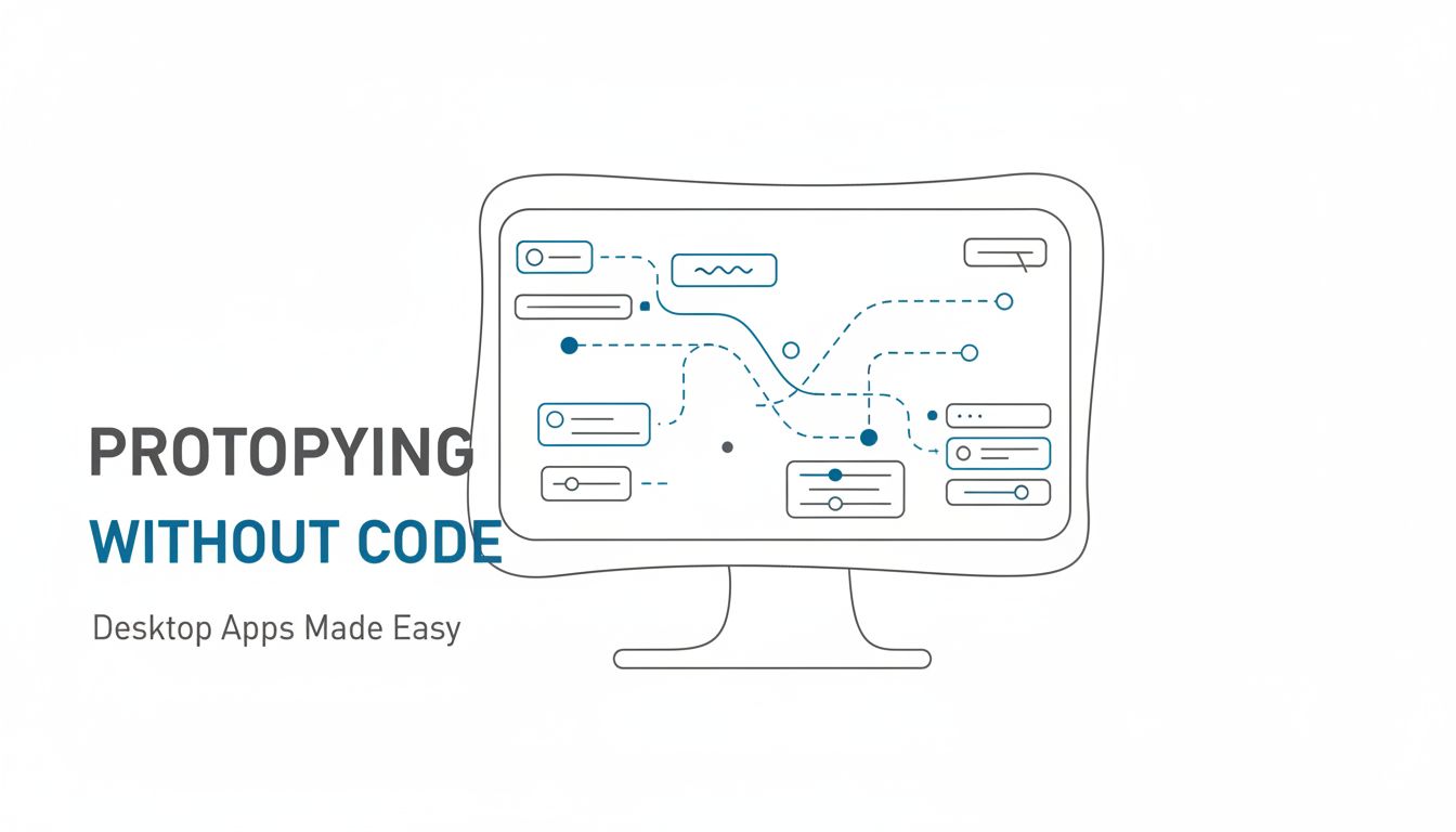
Designing desktop behavior without writing a line of code
Designing believable desktop behavior without code is less about finding a magical tool and more about thinking like a systems designer. You are deciding how windows, panels, and states relate to each other, then using no-code tools to express those relationships. If you try to wire things up screen by screen, you will quickly find yourself drowning in artboards and interaction lines. The way out is to model your application in a structured way before you start pushing pixels.
Start by treating your prototype as a small operating system of its own. It has a primary workspace, secondary surfaces like dialogs and inspectors, and global controls such as menus or status bars. Each of these elements can move through a few well-defined states. When you understand that ecosystem on paper, it becomes much easier to implement it with frames and interactions inside a design tool, even if the tool was originally built with web or mobile in mind.
Mapping windows, panels, and states so they don’t explode on you
The fastest way to lose control of a desktop prototype is to duplicate screens every time something changes. A better approach is to map windows, panels, and states separately. Begin with a simple diagram of the windows your app will have: a main window, optional secondary windows for things like inspectors or chat, and transient windows such as modals or wizards. For each window, list the primary states it can be in, such as "empty project," "project loaded," or "long-running task in progress."
Next, do the same for panels inside each window. A left sidebar might have states like "navigation," "search results," or "filters." A right inspector panel might swap between "object properties" and "history." By thinking in terms of reusable states, you can design components once and reapply them, rather than creating a unique artboard for every combination. In tools like Figma, components and variants are your friends here, because they let you define different states of a panel and switch between them through interactions.
When you wire interactions, link actions to state changes, not to completely new screens whenever possible. For example, clicking a sidebar tab does not need a brand new artboard if you can show it as a different state of the same panel component. Opening a modal can be represented as an overlay on the current window instead of a separate full-screen frame. This approach keeps your prototype manageable, especially when you share it with stakeholders who may want to explore paths you did not explicitly plan during design.
Expressing complex flows with simple interaction patterns
Even intricate desktop workflows are built out of a handful of common interaction patterns. If you choose those patterns early, you can represent quite complex behavior with surprisingly simple prototypes. Wizards, inline editing, master-detail views, batch actions, and progressive disclosure patterns cover a large share of real-world desktop behavior. The key is to decide which patterns you are using where, and stick to them consistently in your prototype.
For example, consider a data import flow that involves mapping columns, previewing results, and resolving errors. You could design this as a linear wizard with back and next buttons, or as a multi-tab dialog with all steps accessible from the start. Your prototype should commit to one, wire it thoroughly, and then you can test how users respond. The pattern you choose will influence both perceived complexity and learnability, so representing it faithfully in your no-code prototype is worth the effort.
When flows get complex, resist the urge to simulate every single branch. Instead, pick a few representative happy and unhappy paths. Show at least one way the process goes smoothly and one way it fails, such as a file with missing columns or invalid values. That gives you a realistic sense of how the system handles success and failure without turning your prototype into a miniature replica of the entire product. If you need to go deeper later, you can layer in additional branches as separate prototype versions.
Handling menus, shortcuts, and system-level actions in prototypes
Menus and keyboard shortcuts are often where desktop apps feel distinctly different from web experiences. Many no-code tools do not support real menu bars or global keyboard handling, but you can still prototype the essence of these interactions. For menus, represent them visually as part of your frame, even if they are not interactive in the traditional sense. You might create a clickable "Menu" area that reveals a screenshot or overlay of options, purely to check the information architecture with stakeholders.
Shortcuts can be simulated through annotations and through carefully staged walkthroughs. For early testing, you can show a cheat sheet of proposed shortcuts alongside the prototype and ask power users whether they make sense. Later, some tools such as Axure or specialized platforms like Vibingbase let you bind keyboard events to interactions. Even a small subset, such as using arrow keys to navigate or a key combination to trigger a command palette, can make a prototype feel dramatically more like a real desktop app.
System-level actions such as resizing windows, minimizing, or moving content between displays are harder to simulate, but you can approximate their impact. For instance, create variants of your main window at different sizes, wired through a simple control that fakes a resize. Use these to test how your layout responds when space becomes constrained. You will not reproduce every behavior of a real operating system without code, but you can capture enough of the experience to validate layout decisions and information hierarchy.
Choosing the right no-code tools for desktop-like prototypes
Once you understand the behaviors you need to express, the tool decision becomes much easier. No single platform covers every use case, so you are looking for a combination that fits your team’s skills, time constraints, and the level of fidelity you need. Many teams start with general-purpose design tools because they already use them for visual design. That is a good default, as long as you are honest about their limits and prepared to extend them with plugins, UI kits, or a secondary tool when you reach the edge.
The trick is not to chase the most powerful tool on paper, but the shortest path to a prototype that tells you what you need to know. A product manager who is comfortable in Figma will move faster there than in a more complex interaction tool, at least initially. A designer who already maintains a design system for a web product may prefer to adapt those components into "desktop-like" patterns instead of starting from scratch in a heavy-duty prototyping platform. Matching tools to the skills and habits you already have is often more important than exotic features.
Using familiar design tools to fake a real desktop experience
Figma, Sketch, and Adobe XD were all built with digital interfaces in mind, and they can be repurposed effectively for desktop app prototyping. The key is to stop thinking of frames as "pages" and start treating them as "windows" or "states." You can construct a frame that looks exactly like a desktop window, complete with title bar, close controls, and resizable edges, and then build the interior of your app inside that. Once you have that shell, you can reuse it across multiple screens to maintain consistency.
Prototype links in these tools can stand in for navigation, button clicks, and simple state transitions. Overlays are particularly useful for dialogs, tooltips, and context menus, since they allow you to show temporary surfaces without navigating away from the underlying window. Component variants allow you to flip between panel states, button states, or toolbar modes without duplicating entire screens. With a bit of discipline, you can create a surprisingly rich representation of a desktop app using nothing more than these standard features.
The main limitation is logic. Complex conditions, loops, and data-driven behavior are hard to represent in a pure design tool. If your prototype needs to branch heavily based on user input or show dynamic changes to tables and graphs, you may hit a ceiling. At that point, you can either fake the most critical states as separate frames or consider introducing a second tool that handles richer interaction while still staying no-code.
When to bring in specialized prototyping tools or UI kits
Specialized prototyping tools, such as Axure, ProtoPie, or more focused platforms like Vibingbase, are most useful when you need lifelike behavior without building a real application. They shine when you care about variables, conditions, and component-level microinteractions. For example, if you want to simulate a complex filter builder that retains state across multiple views, a tool with built-in logic can help you model that precisely. Similarly, if your prototype relies heavily on animations or gesture-like interactions, dedicated interaction tools will feel more natural.
UI kits can shorten the journey significantly. Many vendors offer desktop-focused component libraries that come with window chrome, menu bars, toolbars, and system-standard controls for macOS or Windows. Using these kits, you can assemble a believable desktop interface in hours rather than days, and you can stay closer to platform conventions. The risk of going entirely custom for a desktop prototype is that you accidentally invent patterns users do not understand, simply because you had no reference.
The decision to bring in specialized tools or kits should track your risk profile. If you are only exploring high-level concepts, the overhead may not pay off. If you are validating a critical workflow that will drive months of engineering work, the extra effort to model behavior precisely can be a bargain. Think of it as renting sophistication for a short period, to avoid hard-to-reverse mistakes later.
Keeping your design system and prototype in sync
Desktop products often evolve alongside web and mobile counterparts, which means your design system spans multiple surfaces. When you prototype desktop behavior, you want to keep that system in sync rather than creating a parallel universe. Start by identifying which elements of your existing system can carry over directly, such as colors, typography, icons, and some basic components. Then define a small layer of desktop-specific patterns on top, including window layouts, menu structures, and desktop-style controls where needed.
Using shared component libraries in tools like Figma or Sketch helps maintain alignment. If your primary button style changes, that update should flow into your desktop prototype automatically. More important, your naming, spacing, and motion principles should match across surfaces, so that team members looking at the prototype do not feel like they are examining a completely separate product. Consistency here reduces friction when engineering begins implementing the real application using the same design tokens and guidelines.
As your desktop prototype matures and informs product decisions, feed those learnings back into the design system. Perhaps you discover that a particular pattern works brilliantly in a desktop context but causes confusion on the web. That is valuable information that should shape how your team documents component usage. Treat the prototype not just as a throwaway artifact, but as a live experiment that evolves the broader system.
Turning your prototype into a shared decision-making tool
A prototype becomes truly valuable when it moves from your design tool into the collective mind of the team. That only happens when people can use it as a shared reference point during discussions about scope, priorities, and tradeoffs. Instead of arguing abstractly about whether something is "too complex" or "not intuitive," you can walk through the prototype and watch where confusion or friction appears. The more realistic the desktop behavior feels, the more grounded those conversations become.
For product managers, an interactive desktop prototype becomes a way to rehearse launch scenarios, pricing conversations, and customer pitches. For designers, it becomes a canvas on which to test interaction patterns with real users before committing engineers. For engineers, it becomes a visual contract that reduces ambiguity and misinterpretation. When everyone interacts with the same artifact, misaligned assumptions surface earlier and more gently.
Running realistic walkthroughs with stakeholders and users
The way you present a desktop prototype matters as much as the prototype itself. Whenever possible, run walkthroughs in a realistic environment: on a laptop or desktop, in a window that fills the screen, without the extra chrome of the design tool visible. Treat it as if you just installed an early build of the app and are guiding someone through their first session. This framing helps stakeholders shift from "reviewing designs" to "using software," which changes the kind of feedback you receive.
Encourage participants to operate the prototype the way they would a real app. Ask them to move quickly, to use their normal habits, to click where they think something should be rather than where you tell them. You will notice moments where they reach for keyboard shortcuts that do not exist yet, or expect right-click menus in places you have not planned. These reactions are gold, because they reveal implicit expectations you can either meet or intentionally break.
Capture their questions and hesitations in context. When someone asks, "Where would I find settings for this?" note whether they look to a menu bar, a gear icon, or a right-click menu. When they run into a dead end in the prototype, resist the urge to explain. Instead, observe how they attempt to recover. These insights should feed directly into decisions about structure, naming, and behavior in the next iteration.
What to measure and capture before moving toward dev
Before you hand anything to engineering, you want evidence that your desktop prototype has done its job. That does not mean formal A/B test statistics, but you should have clear answers to a few concrete questions. Do users understand the main navigation model without coaching? Can they complete the primary workflows within a reasonable time, and do they feel in control throughout? Where do they hesitate, backtrack, or express confusion?
You can track a small set of qualitative and quantitative signals in each session. Time to complete a task, number of misclicks on the way to a destination, or the number of times a user asks "What happens if I do this?" are all useful. You can also capture confidence scores after key workflows, asking users how confident they feel performing the task again on a scale from one to five. Patterns across even five to eight users will reveal whether your core patterns are holding up.
In addition, capture internal signals from the team. Did engineers raise concerns about technical feasibility while reviewing the prototype? Did sales or support identify scenarios that would generate heavy support volume? These internal reactions, combined with user observations, form a set of criteria that the design should meet before engineering commits to building it. The more explicit you are about those criteria, the less likely you are to discover painful surprises late in the cycle.
Preserving prototype decisions so engineering isn’t guessing
When a prototype has influenced important decisions, you want those decisions to survive translation into code. That means documenting not just what the prototype does, but why. Instead of handing engineers a maze of link hotspots, give them a distilled map of states, transitions, and key principles. For example, note that closing a modal should always return the user to the underlying context without discarding unsaved work, or that certain destructive actions require confirmation while others do not.
Link specific prototype flows to user insights, so that when engineers implement them they understand the tradeoffs involved. If you decided against a more efficient but less discoverable shortcut pattern because users repeatedly missed it in testing, say so. It helps the team resist the temptation to "simplify" behaviors in ways that reintroduce old problems. When decisions are grounded in observed behavior rather than personal preference, they carry more weight.
Tools like Vibingbase and others that combine prototyping with light documentation features can reduce friction here, because they let you annotate interactions directly. Even if your primary prototype lives elsewhere, you can maintain a simple decision log that references key flows. The goal is not exhaustive specifications, but enough clarity that engineers are not decoding intent from static mockups. A concise set of principles, supported by an accessible prototype, gives them room to solve implementation challenges without reinventing the user experience.
Closing thoughts
Desktop app prototyping without code is not about pretending to be an engineer. It is about giving your team a realistic enough experience that you can make smarter decisions before anyone writes a single line of production code. When you focus on behavioral fidelity, map windows and states carefully, and choose tools that fit your team, you can explore bold ideas with far less risk. Your prototypes become instruments for learning, not just sales demos for an internal audience.
A natural next step is to pick one important workflow from your product, sketch its states and windows on paper, then rebuild that sketch in your preferred no-code tool as a desktop-like prototype. Share it with a few trusted users or stakeholders, watch what they do, and capture what surprises you. With each iteration, you will get more comfortable expressing complex desktop behavior in lightweight ways, and that comfort will pay off every time you face the next big product decision.