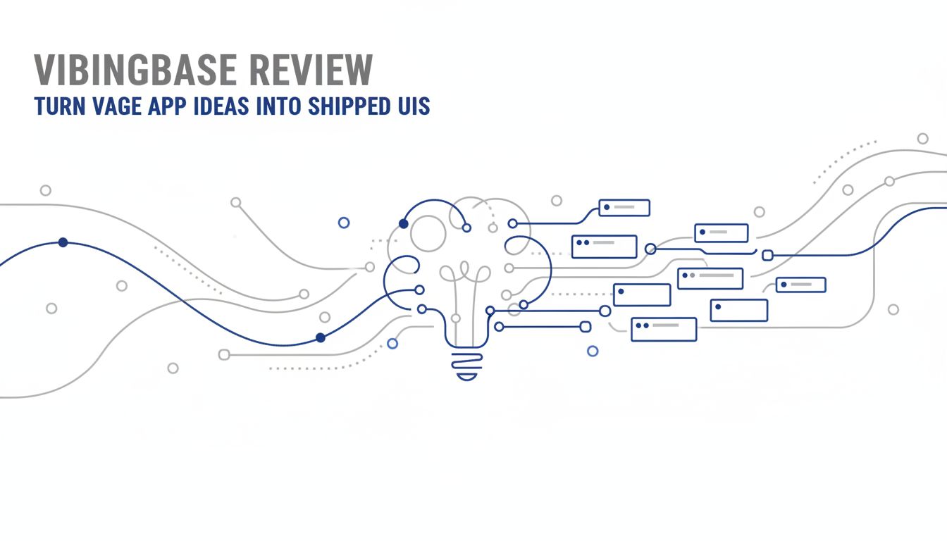
Vibingbase review: turn vague app ideas into shipped UIs
You know that feeling when you have an app idea that is obviously useful, but your brain shows you a blank gray rectangle instead of a real UI?
You write some notes. Maybe a Notion doc. Maybe a few boxes in Figma. Nothing feels right. So you stall.
This is exactly the gap Vibingbase is built to close.
This vibingbase review is for indie hackers and solo makers who are tired of losing momentum between "I know what problem to solve" and "I know what this app should look like on screen."
Let’s walk through what Vibingbase is actually doing for you, where it stops, and whether it is worth folding into your workflow.
First, what is Vibingbase actually trying to do for you?
Vibingbase is not trying to be your full design tool, your PM system, or your UX agency in a box.
Its actual job is simpler and more surgical. Vibingbase takes your messy, half-formed app idea and gives you a concrete, opinionated UI direction that you can ship.
It sits in that awkward middle:
- After "I know the user problem and rough feature list"
- Before "I am wiring up real screens in code or Figma"
Think of it as a UI co-pilot that cares more about structure and flows than pixel-perfect aesthetics.
How it fits into an indie hacker’s workflow
If you are building desktop utility or productivity apps, your workflow probably looks something like:
- Capture idea in notes.
- Sketch features, maybe some flows.
- Fiddle in Figma or start coding UI directly.
- Realize the layout is confusing and rework half of it.
Vibingbase inserts itself between steps 2 and 3.
A common flow:
- You describe the app, your users, and a few key actions.
- Vibingbase suggests core screens, layouts, and interaction patterns.
- You pick a direction, refine it, and then implement in your tool of choice.
The goal is not "AI that designs your app." The goal is "AI that removes the scary blank canvas and gives you a strong first draft."
Where it stops and your product work begins
Vibingbase does not:
- Validate the market for you.
- Decide your feature set.
- Make all tradeoffs about complexity vs power.
- Replace your taste.
Vibingbase shines when:
- You already understand the problem.
- You know roughly what users need to do.
- You are blocked by structure and layout, not by vision.
Think of it as a UI accelerator, not a product strategist. If you go in with a fuzzy problem, you will come out with a nice looking, fuzzy product.
Why Vibingbase matters when you’re shipping alone
When you work solo, every hour is doing triple duty. Product. Design. Engineering. Support.
UI decisions are sneaky. They look small, but each one can trigger:
- Design exploration.
- Technical tradeoffs.
- Edge cases you did not plan for.
That is how a "quick MVP" quietly mutates into a 6 week project.
Vibingbase aims to reduce that surface area.
From vague problem to concrete UI direction
There is a big difference between:
- "I want to build a local-first habit tracker for devs."
- "I want a 3-panel layout. Left side for habits. Middle for today’s timeline. Right panel for logs and notes, with keyboard shortcuts for quick capture."
Vibingbase pushes you toward the second kind of clarity.
It nudges you into specificity:
- What are the primary objects in your app?
- What is the main action on each screen?
- What should be visible all the time, and what can be tucked away?
You get named screens, explicit flows, and a coherent layout strategy in a way that matches desktop app reality. Think sidebar navigation, resizable panes, keyboard-centric workflows.
[!TIP] Use Vibingbase to force yourself to pick "the main thing" on each screen. If everything is primary, nothing is.
Once that skeleton exists, coding feels mechanical. You are filling in a structure instead of inventing it as you go.
Protecting your limited design and dev energy
Design indecision is where solo makers quietly bleed out.
You open your project "for 20 minutes" and spend all of it wondering:
- Table or list?
- Modal or inline edit?
- One window or multiple?
The biggest win from Vibingbase is not magical design quality. It is decisiveness.
It lets you:
- Commit to a coherent pattern early.
- Avoid rewriting the same screen three times.
- Stop bikeshedding basic layout questions.
Suddenly your cognitive load shifts from "what should I even build" to "how do I implement this flow well."
That shift is what gets versions shipped.
How Vibingbase works in practice for desktop app builders
Let’s make this less abstract.
Here is what using Vibingbase looks like when you are building a desktop app, not another marketing site.
A realistic day-in-the-life walkthrough
Imagine you are building a macOS and Windows utility: a clipboard manager for developers that keeps code snippets searchable offline.
You sit down in the morning with coffee and Vibingbase.
You describe the product in your own words
- "Local clipboard history for developers. Focus on code, snippets, commands. Desktop app, keyboard-first, no cloud account."
- "Main actions: search past copies, pin snippets, tag them, and quickly paste."
Vibingbase proposes core screens and structure It might suggest:
- A compact main window with 2 modes: "History" and "Snippets."
- A detail panel for metadata: language, tags, app source.
- A system tray / menu bar entry for quick open.
- Global keyboard shortcut to bring up search.
You refine constraints and preferences You tell Vibingbase:
- "I want a single main window, no multi-window madness."
- "Dark theme first. Light theme later."
- "Search should be the default entry point."
Vibingbase updates the layout. Now search is the hero. Filters are secondary. Pins become a simple toggle, not a separate view.
You get specific screen breakdowns For example:
- "Main window: left filter column with language and tag filters. Center list of recent items with icons for the app they came from. Right preview panel with syntax highlighting and copy / paste buttons."
- "Quick search overlay: single search field, instant results list, up/down navigation, hit Enter to paste."
You export this into your stack You do not need pixel-perfect UI code. You need a blueprint.
So you:
- Screenshot or export layout summaries.
- Recreate them in your UI toolkit or Figma.
- Implement only what survived the prioritization.
By lunch, you have a coherent set of screens and flows. By afternoon, you are coding, not staring at a blank window.
Vibingbase held your hand through the fuzzy visual thinking stage, then got out of the way.
Examples: turning 3 utility app ideas into testable concepts
Let’s run through three quick app ideas and what "Vibingbase-powered clarity" might look like.
1. Local log viewer for multiple services
Raw idea: "Desktop app to tail multiple log files from different services, with filters and alerts."
Without help, this turns into a messy terminal-clone UI.
With Vibingbase-style structure, you might end up with:
- A 3-pane layout.
- Left: list of services with status indicators.
- Center: real-time log stream with color-coded log levels.
- Right: active filters, saved queries, and alert rules.
Now you can build a rough version in a weekend and show it to 5 potential users.
2. Focus timer that controls your distractions
Raw idea: "App that blocks specific apps and sites while you are in a focused session."
Many people would default to a single cluttered "settings monster" screen.
A stronger concept:
- Home screen: big "Start focus session" button, shows current profile and duration.
- Profiles screen: list of focus presets (Coding, Writing, Meetings). Each with apps and sites to block.
- Session history: basic analytics like total focused time per day.
You do not need Dribbble-level visuals to test this. You just need clear, separate contexts, which is exactly the structure Vibingbase nudges you toward.
3. Git commit assistant for solo devs
Raw idea: "Desktop tool that suggests good commit messages and groups changes logically."
Easy to overcomplicate.
A minimal testable concept:
- Repo selector: pick a repository and see pending changes.
- Change grouping view: suggested groups with files under each. You can merge / split.
- Commit composer: preview message suggestions, edit final text, and commit.
You can build a barebones UI that follows this flow and ship an alpha, instead of endlessly debating tabs vs tabs-within-tabs.
[!NOTE] The pattern across all three: Vibingbase helps you find the "just enough screens, each with one job" structure that is so critical for utility apps.
The hidden costs, hard limits, and who should skip it
Let’s be blunt. Tools that "help you think" can become new forms of procrastination.
Vibingbase is no exception if you approach it the wrong way.
Where Vibingbase will not save you time
Vibingbase does not magically compress work that is fundamentally hard, like:
- Choosing what not to build.
- Resolving conflicting user needs.
- Handling complex domain rules.
In fact, if your problem is still undercooked, Vibingbase can slow you down, because:
- It will happily generate 3 or 4 plausible UI directions.
- You will feel compelled to explore all of them.
- You will delay making a call.
The other hidden cost is over-fitting to what feels "clean" instead of what is actually needed.
AI-guided structure tends to like tidy hierarchies and obvious flows. Real products often need a weird, slightly ugly shortcut for power users. You must still push for that.
Red flags: signs your project isn’t a good fit
You probably do not need Vibingbase if:
You are cloning a known pattern almost 1:1. Example: A simple note app that follows Apple Notes closely. Copy the pattern, ship.
You are building something visual-first, where brand and unique interaction are the product. Example: A creative design tool, a music-making app with custom controls. You will be in Figma and code anyway.
Your bottleneck is purely backend or algorithmic. Example: Heavy data processing where UI is an admin console. Use a basic CRUD dashboard and move on.
You are a strong candidate if:
- You keep restarting designs from scratch every few weeks.
- You have several half-built UIs sitting in repos.
- You find yourself saying "I know what this should do, I just do not know how to lay it out."
In that case, the friction is in the idea-to-UI translation. Vibingbase is aimed directly at that pain.
Pricing, ROI math, and how to test Vibingbase without wasting a week
Let’s talk money and time, the only two things that really matter when you are shipping solo.
I am going to keep this grounded in indie hacker reality.
Quick payback calculation for solo makers
The actual sticker price of Vibingbase will be on the site. The real question in your head is something like:
"If this saves me 5 hours this month, is it worth it?"
So do a basic back-of-the-envelope:
Assume:
- You value your time modestly at 50 dollars per hour.
- You lose 8 to 10 hours per feature release on design back-and-forth and refactoring messy UI.
If Vibingbase helps you:
- Settle on a layout in 1 or 2 sessions.
- Avoid one major redesign of a key screen.
You save something like 4 to 6 hours per meaningful feature. That is 200 to 300 dollars of value on a single cycle, even if you are conservative.
Now compare that to Vibingbase cost:
| Scenario | Value of hours saved | Vibingbase monthly cost | Net result |
|---|---|---|---|
| You save 2 hours per month | 100 dollars | Less than that | Break-even or better |
| You save one half-day per feature cycle | 200 to 300 dollars | Much less than that | Strong positive ROI |
| You rarely ship or rarely do UI reshuffles | Near 0 | Any cost | Probably not worth it |
The lever is simple. If you ship features or new products regularly, even modest efficiency on UI decisions compounds very fast.
If you ship once a year, nothing will save you. Tool or not.
A 3-day trial plan to see if it actually helps you ship
You do not need a month-long experiment to know if Vibingbase is useful to you.
Treat it like a sprintable experiment, not a new religion.
Here is a straightforward 3-day test:
Day 1: Pick a feature or small app
- Choose one concrete thing to ship in the next 7 days.
- Write a short problem statement and constraints.
- Spend 60 to 90 minutes in Vibingbase to get a full UI outline.
Deliverable for the day: A set of named screens, rough layouts, and a simple flow diagram you are willing to commit to.
Day 2: Implement only what survived
- Rebuild the chosen layout in your tech stack or Figma.
- Do not re-architect. Follow the structure.
- Make only necessary tweaks for feasibility and platform quirks.
Deliverable for the day: A working, ugly-but-functional UI that follows the plan.
Day 3: Validate the results
- Show the feature or prototype to 3 to 5 users, friends, or other makers.
- Ask concrete questions:
- "Can you tell what this screen is for?"
- "What is the first thing you want to click here?"
- "What feels confusing?"
Now reflect:
- Did Vibingbase help you reach a shippable UI faster than your usual process?
- Did it cut down on rework or increase it?
- Did you feel more decisive, or more overwhelmed with options?
[!IMPORTANT] The test is not "Did Vibingbase design something perfect?" The test is "Did this tool reduce friction enough that I shipped something earlier than I otherwise would have?"
If the answer is yes and you are planning to ship multiple features or apps this year, the ROI case mostly writes itself.
So, should you actually use Vibingbase?
Here is the simplest heuristic.
If you are a solo builder of desktop utilities and productivity tools, and your current bottleneck lives between "I know what to build" and "I know what it should look like," Vibingbase is worth a serious trial.
It will not:
- Magically invent a product people want.
- Give you design taste you do not have.
It will:
- Turn vague problems into concrete UI directions.
- Protect your design and dev energy from indecision.
- Help you move from idea to shipped UI faster, which is where solo builders win.
Your next step is straightforward:
Pick one small but real feature or app. Give yourself 3 days. Run it through Vibingbase with the plan above.
If at the end of that you have a working, testable UI instead of another abandoned mockup, you have your answer.